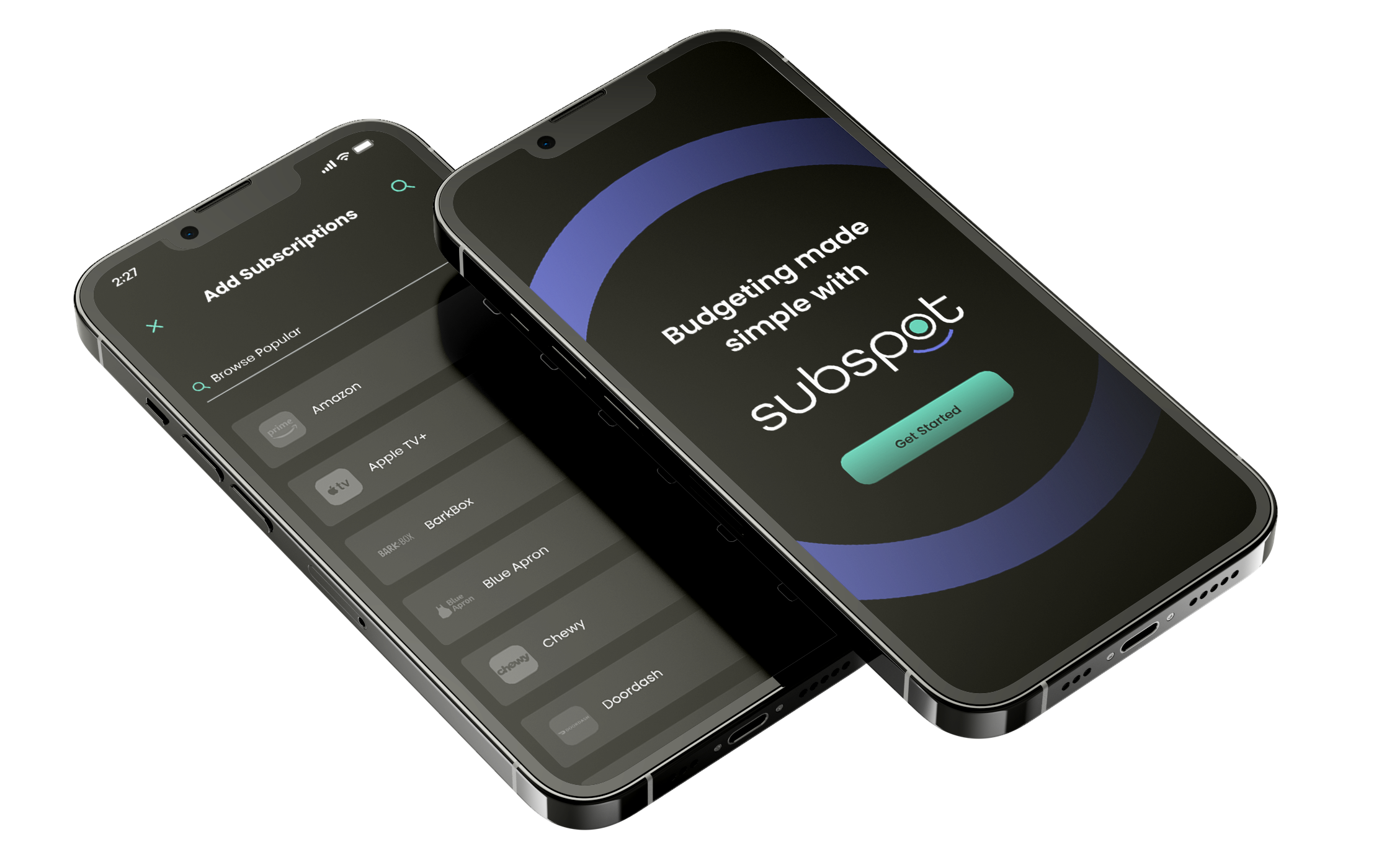
SubSpot
Organize your subscription services to manage spending, view renewal dates, and easily unsubscribe from unwanted services.
The Team: David Güiza Caicedo
My Role: End to End UX/UI Designer
Project Description
This research aims to gather insights for transitioning a subscription and recurring service management company's web-based platform to a mobile app. The primary objective is to expand the company's business reach by targeting a wider audience. Users seek a comprehensive solution to manage all their subscription services in one place, allowing them to track monthly spending. Additionally, budget-conscious users desire the ability to unsubscribe from specific subscriptions, while timely alerts about auto-renewal dates are also crucial for informed decision-making.
Project Goals
The aim of this research is to assess user satisfaction with current methods of managing subscription and recurring services. Additionally, we aim to gather data on how users budget for these services, track payment due dates, auto-renewals, and identify any frustrations with their current processes.
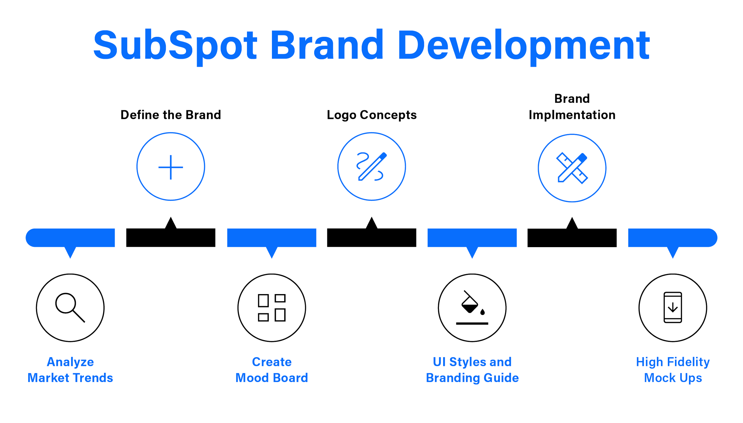
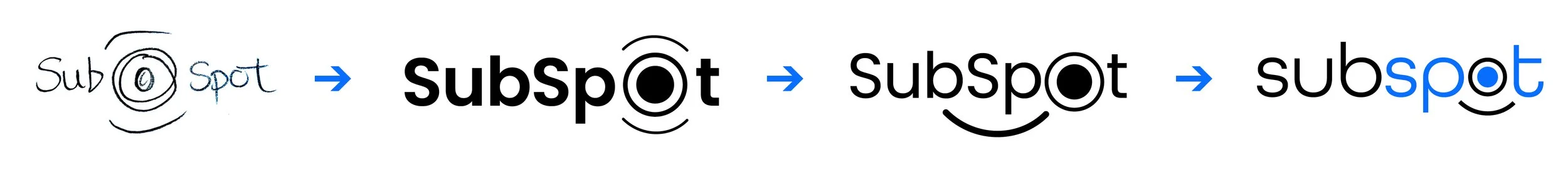
Logo Concepts
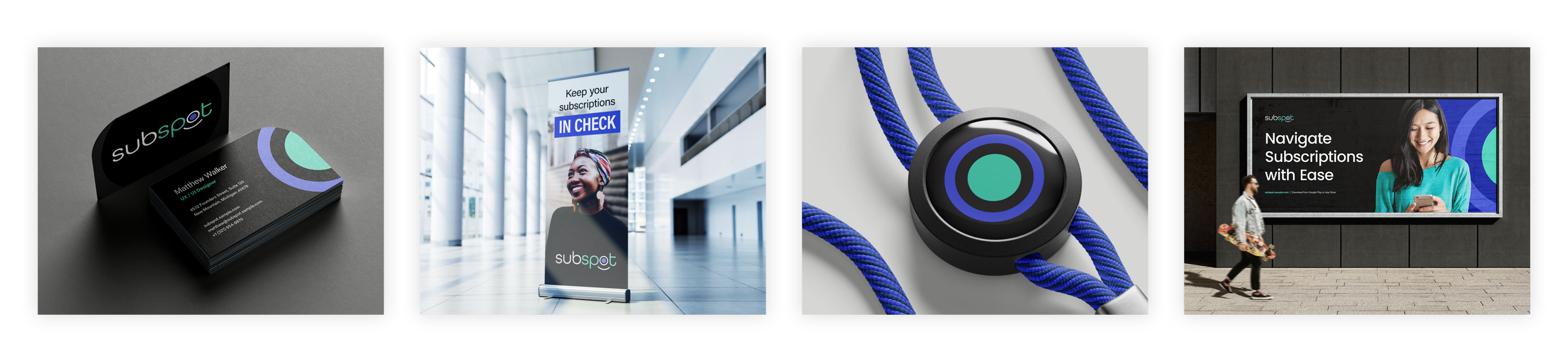
The logo is a symbol of the app's essence: a central hub for organizing subscriptions. The main circle represents Subspot's core, with a smaller circle inside, resembling a pie chart for budgeting. The line beneath forms a smiling face, reflecting positivity. This visual speaks to our goal of simplifying budgeting and promoting financial well-being, with a smile.
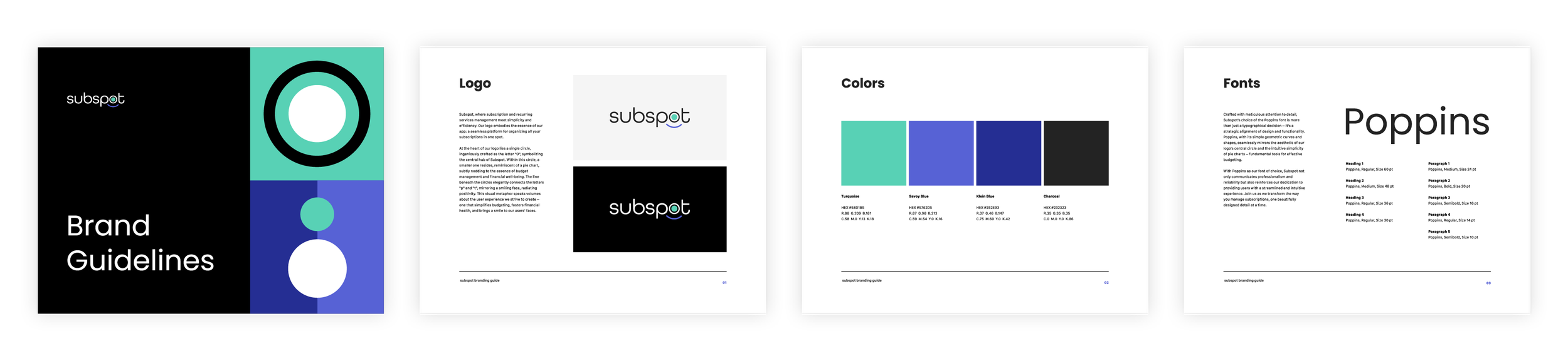
Branding Guide
I designed the branding for SubSpot to complement its circular logo mark, aiming to enhance its overall identity. Initially, I selected teal to symbolize financial matters, but it didn't meet accessibility contrast standards. To address this, I introduced bright blue, not only for its depth but also for improved legibility and functional purposes.
Brand Implementation
While developing the brand implementation, the primary focus was on utilizing the circle/target mark to create a simple yet recognizable brand identity. Additionally, integrating lifestyle imagery was crucial to reflect the sense of happiness conveyed by the logo and to demonstrate how the app enhances users' overall well-being.
Industry Leaders
To gain insights into the competitive landscape and understand user expectations, I analyzed three subscription management apps:
Subscriptions
Bobby
Subscription Manager
After analyzing each, I identified approaches I wanted to implement as well as ones I wanted to avoid.
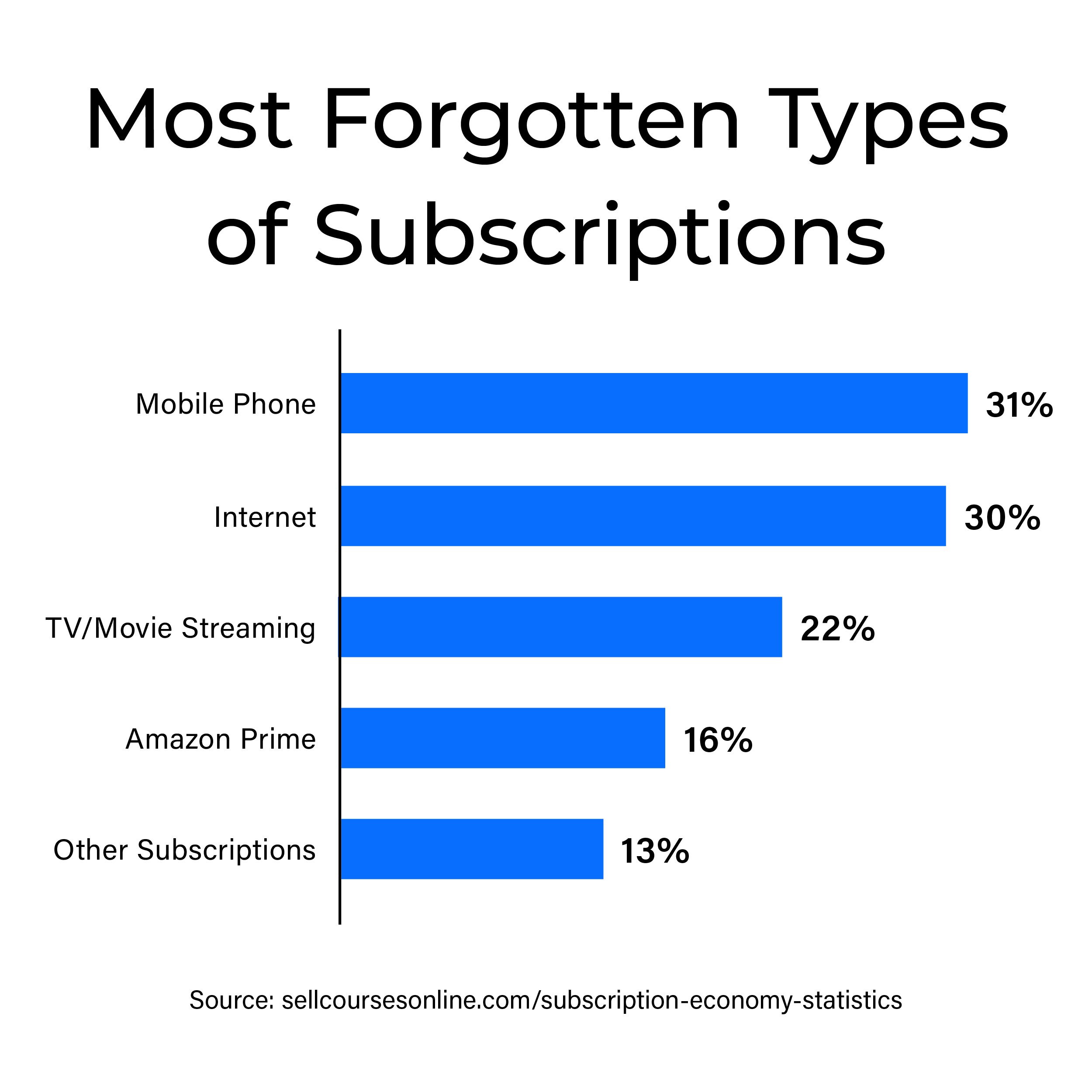
Gathering Qualitative and Quantitative Data
After reviewing the specific user criteria, targeting individuals over the age of 30 from the middle-class demographic with one or more subscriptions, I opted to create an online screener. This screener would serve as a preliminary step to filter participants and gather data simultaneously through an online survey.
While the approach successfully collected quanitative data, I found that many of the questions lacked the depth needed to uncover the broader insights I sought. Although I initially anticipated that 44 responses would suffice to proceed to the ideation phase, I ultimately decided to repurpose the survey as a detailed screener. This allowed me to gather participants for interviews aimed at gaining specific insights into key areas of research.
Solution Sketching
To develop essential screens, I initiated the sketching process by identifying key user requirements gathered from interviews. These requirements were categorized into several sections:
Existing Reminder Systems
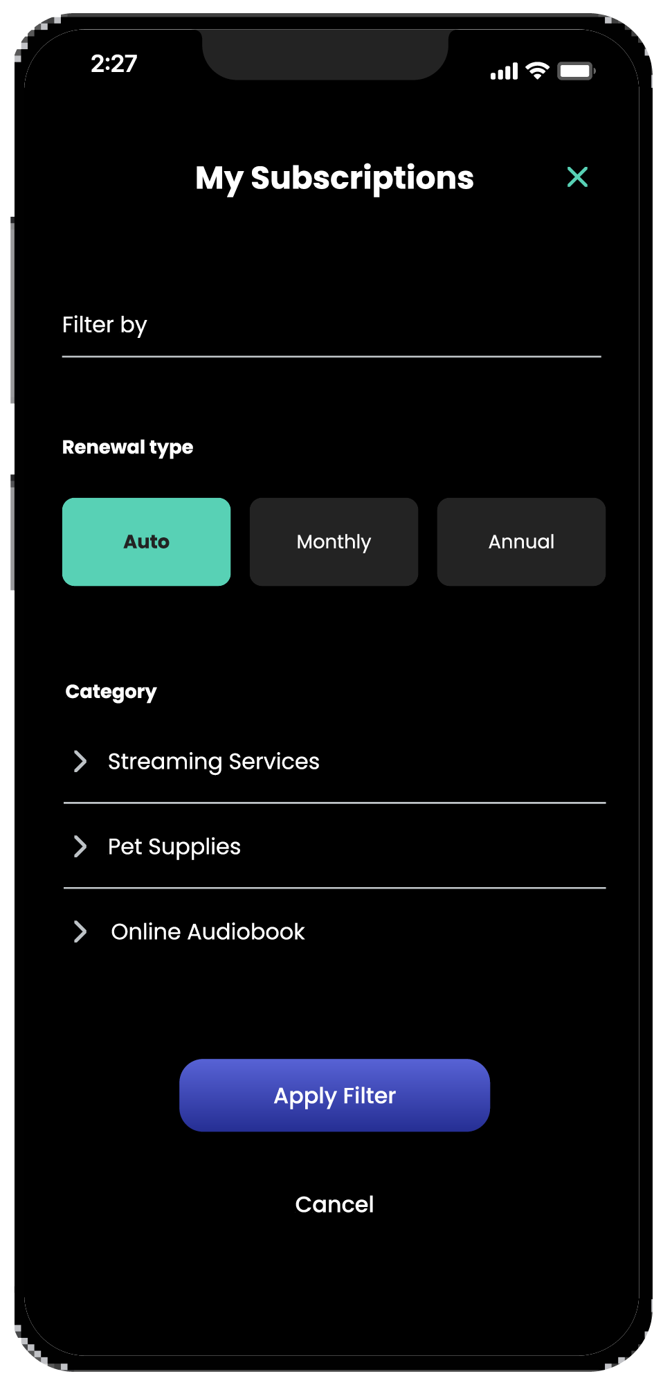
Cancellation Experience
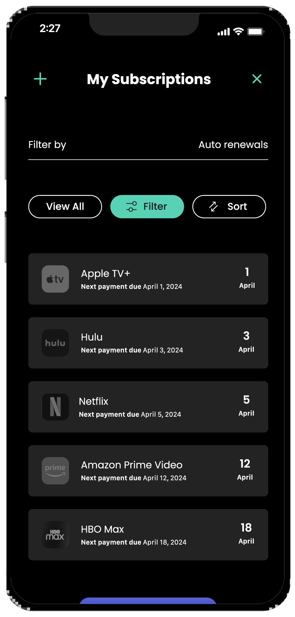
Management of Renewal Dates
Receipt of Billing Reminders
Absent Account Details (such as missed payments, additional charges, and trial end dates)
Once these parameters were established, I commenced crafting key screens with rough pencil sketches and wireframes. I prioritized them based on the three key user journeys to develop a navigation system before proceeding to digital designs.
User Testing Summaries
Low Fidelity Prototype User Testing Summary
I conducted 3 interviews with UX professionals I connected with on LinkedIn. Based on previous methods of user testing, I found speaking with professionals in the field in early iterations offered valuable insights before creating a high-fidelity prototype.
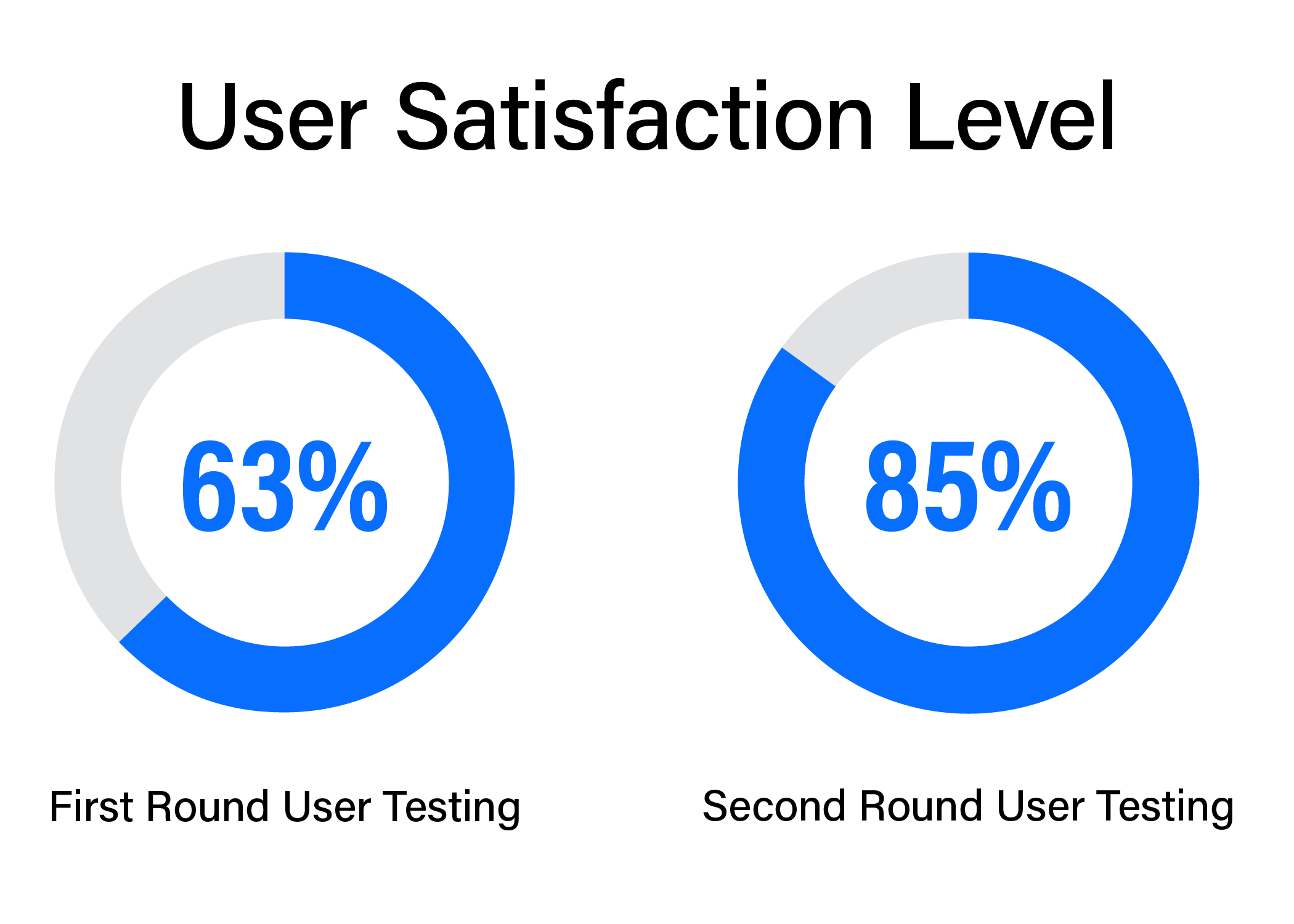
High Fidelity Prototype User Testing Summary
After implementing the proposed solutions into the first prototype, the high-fidelity prototype was developed. Updating functionality concerns addressed in the first round of user testing was key. Implementing branding guidelines was a bit of a challenge as the first iteration of branding only had a single green color that limited its functionality.
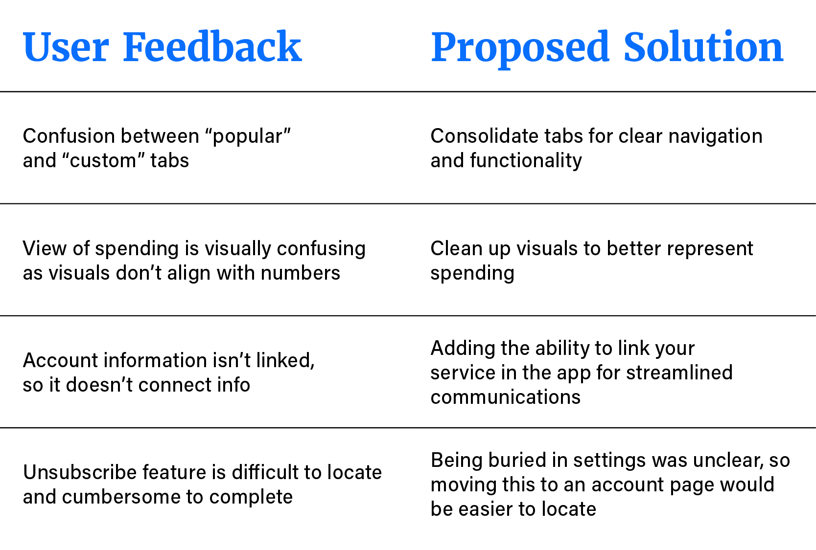
Feedback during the testing of the high-fidelity prototype:
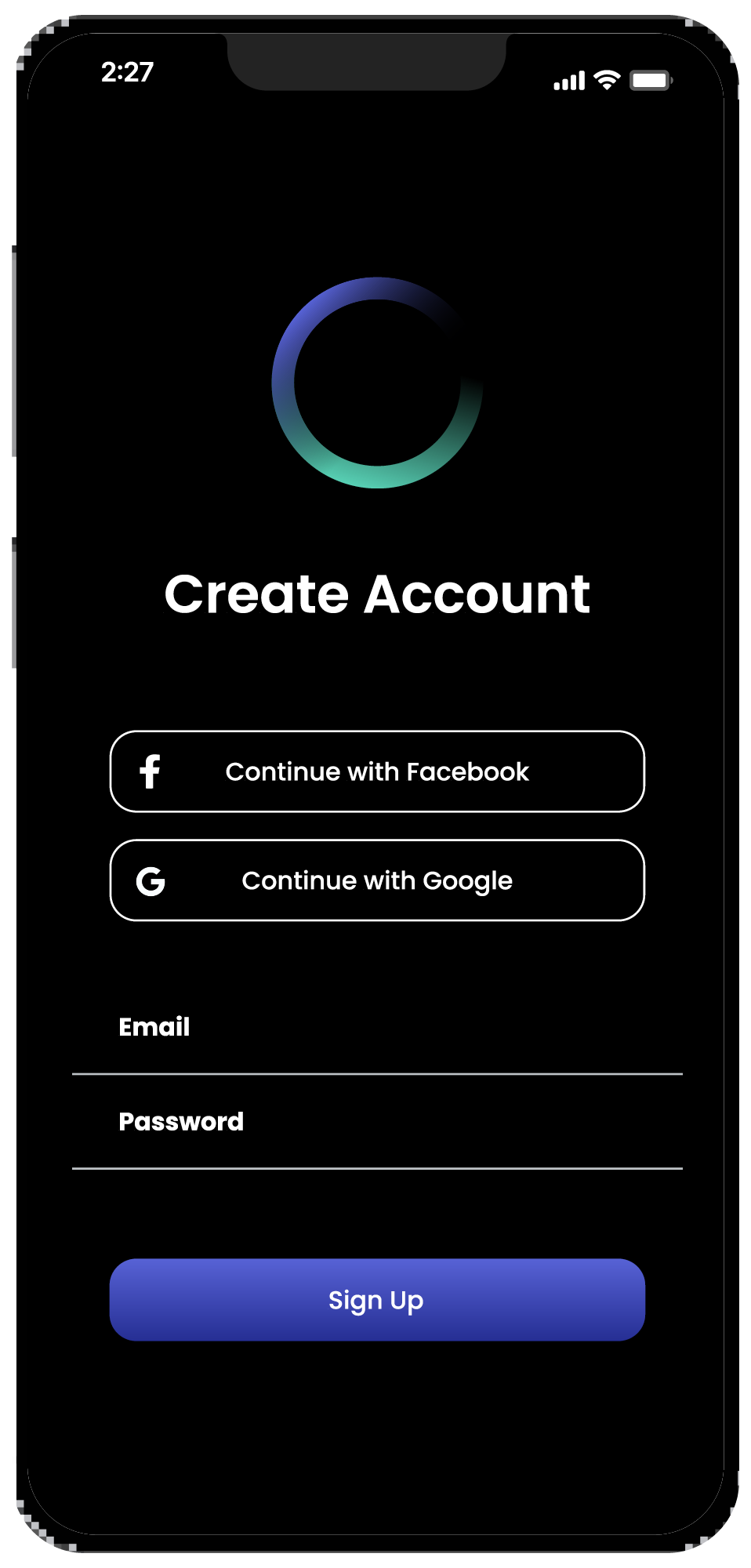
Creating an account was simple and easy to follow.
Frustrations with the Figma prototype not functioning as users would have hoped.
Uncertainty with budgeting figures such as total budget and savings goal.
Unsubscribe was easier to locate than the previous low-fidelity prototype.
Key Insights
During the first round of user testing, the focus was on clarifying verbiage, refining layout, and adjusting button colors to improve user experience. Common themes emerged, leading to adjustments in subsequent iterations. In the second round, feedback centered around fine-tuning visuals and reworking confusing navigation elements.
One notable improvement was the inclusion of the popular service screen, which resonated positively with users. This feature helped users identify and manage their top subscription services, addressing the challenge of remembering all their current subscriptions.
Project Summary
I had drafted a project plan before beginning research, and after wrapping up the project, very little actually held true to the plan. I had hoped to create a survey to gather extensive qualitative data, but it proved somewhat irrelevant compared to the qualitative insights gained from user interviews. Additionally, I spent too much time on crafting UI elements in the low-fidelity prototype, neglecting functionality. While a more designed prototype proved beneficial for initial testing, it hindered the creation of the high-fidelity mockup due to the extensive rework needed for the second round of user testing.