ScriptsPlus
Streamlining prescription management to improve communication and enhance overall well-being.
The Team: David Güiza Caicedo and Diane Sheneman
My Role: End to End UX/UI Designer
Define the Problem
Project Description
Patients managing prescriptions, whether for themselves or others, encounter the ongoing challenge of accurate and efficient management. Issues like inconsistent inventories, outdated refill processes, and communication gaps among patients, providers, pharmacies, and insurance companies exacerbate the situation. In my role as a UX researcher, I focused on gathering user insights to develop an app aimed at streamlining and improving this complex process.
Project Goals
The project goal of ScriptsPlus is to develop a user-friendly and comprehensive prescription management app that simplifies the process of managing multiple prescriptions for users, providing enhanced convenience, organization, and accuracy in medication management.
Crafting Industry Analysis
After establishing our research goals, I conducted an analysis of current competitor products to gather insights on features that were executed well and areas needing improvement. This preliminary research was crucial prior to conducting user interviews, especially considering that our user interview screener indicated that most users were currently managing their prescriptions with an app. Therefore, having a comprehensive understanding of current available technology was essential for effectively interviewing users about their experiences.
-
Identifying competitors through internet searches and app store assessments to gather prescription management app competitors involves analyzing features, user reviews, ratings, and pricing. This helps us understand key players in the market, their strengths and weaknesses, and opportunities for differentiation.
-
Creating the criteria for analysis is developed based on industry standards, user needs, market trends, and competitive benchmarks to ensure a comprehensive evaluation.
-
To strategize and prepare for analysis, I started by defining clear objectives and selecting key metrics such as usability, functionality, and user satisfaction.
-
I gathered data from various sources like app reviews and competitor websites. I compared this data against my metrics to ensure consistency and accuracy. I consistently reviewed and update your criteria based on new insights.
-
I recorded my findings using visual aids and summaries, ensuring the documentation is easily shareable and can be referenced for future decision-making.
Recruiting Participants
We selected participants based on their familiarity with healthcare technology and the total number of prescriptions they manage, whether for themselves or others. Additionally, we considered various factors such as where patients obtained their prescriptions, the type of medication, and the technology provided by their chosen healthcare provider and pharmacy.
Screening Questions
Frequency of prescription medication management (never to more than once a week)
Who they manage medications for (myself, my family, or as a caregiver)
How many prescriptions do you manage? (1 or 2, 3 or 4, 5 or more)
How satisfied are you with your current medication management system? (Very dissatisfied to very satisfied)
User Interviews
Interviews with users and patients collected very comprehensive feedback about their experience with prescription management technology. Most users had limited positive experiences with their current systems. The majority of insights gathered were about how their systems weren't working and how they could be improved. While this was great for ideation, with so much data, we had to wonder, how can we get to the core of our goal?
“An app should be intuitive and easy to use. If I'm not happy with it, I'll simply switch to another app that meets my needs.”
– User Interview Participant
We developed five 'how might we' questions to clearly set goals before we began to ideate.
-
How can we offer user-friendly tools and proactive alerts for control over medication tracking?
-
How can we alleviate stress and anxiety by implementing a beneficial system with enhanced automation features?
-
How can we guide users in medication management through clear materials and interactive tutorials?
-
How can four-party systems integrate seamlessly for user benefits without restricting other parties?
-
How can customer support be improved with a integrated chat feature for convenient communication with providers and pharmacists?
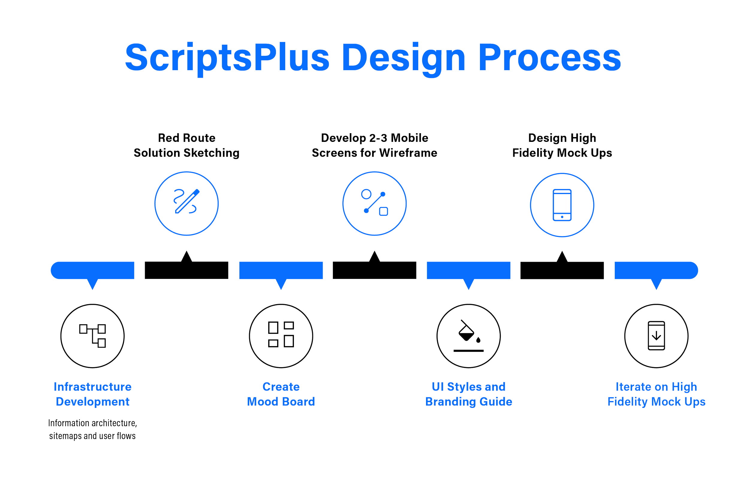
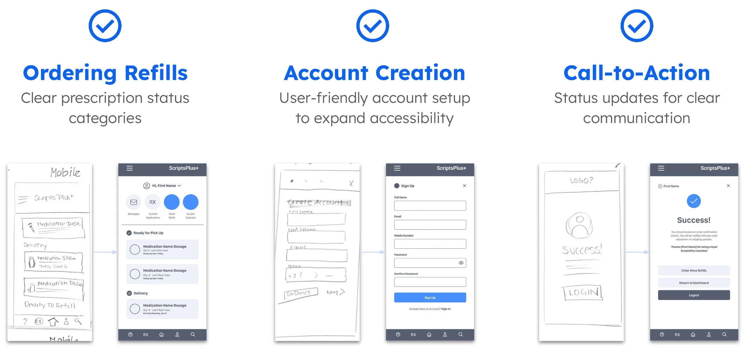
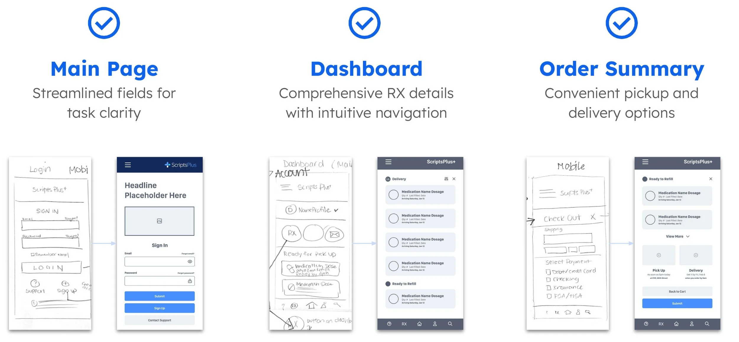
Solution Sketching
During the initial design phase, quick sketches were created to identify the necessary content areas for the key routes, which include:
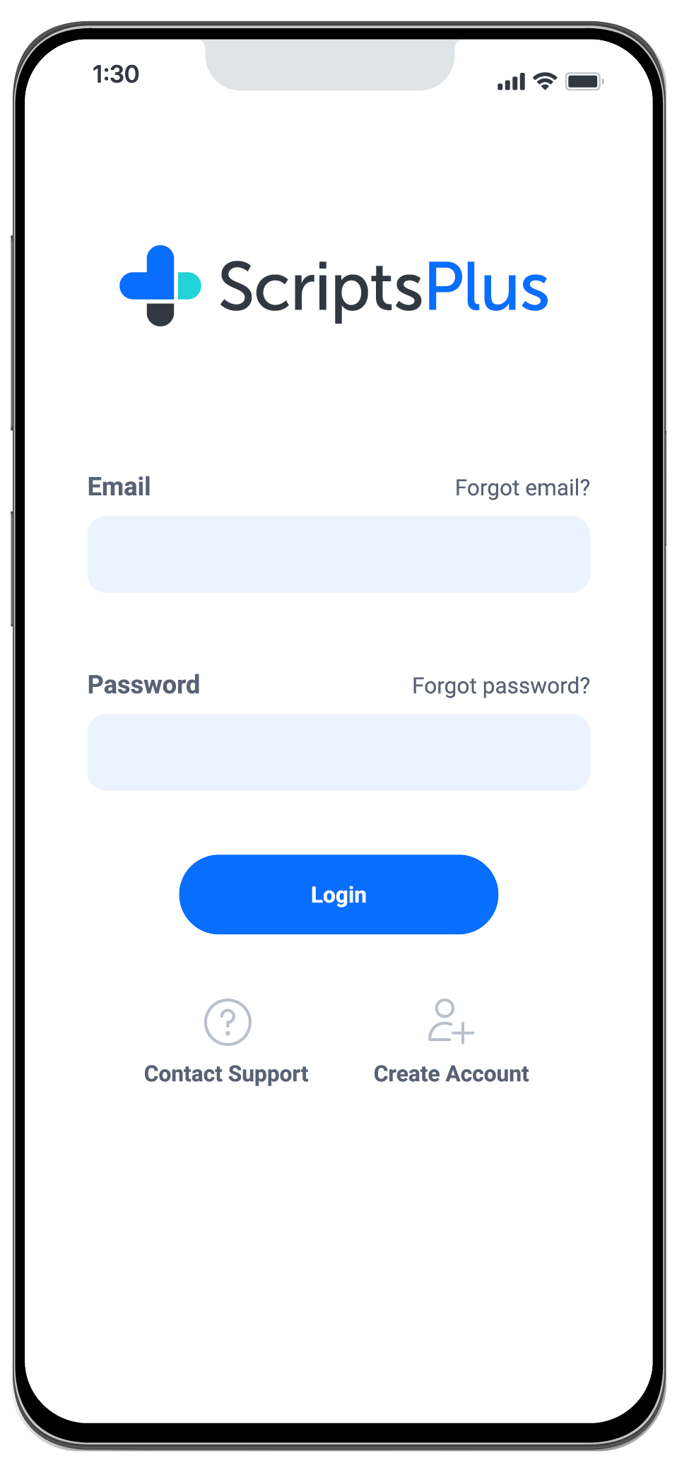
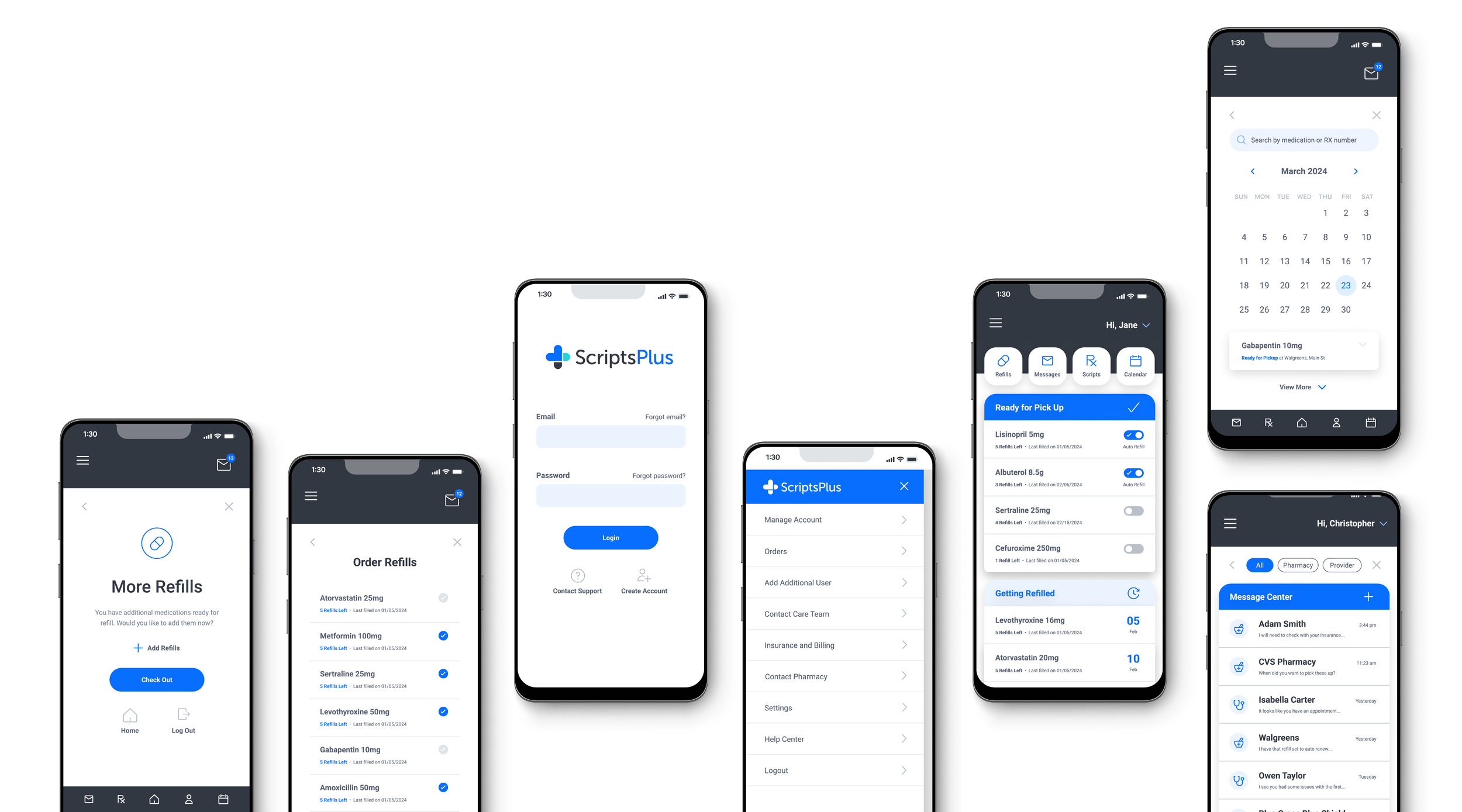
Creating an account
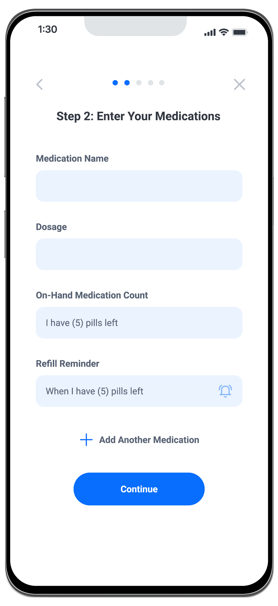
Adding a prescription to the dashboard
Refilling a medication
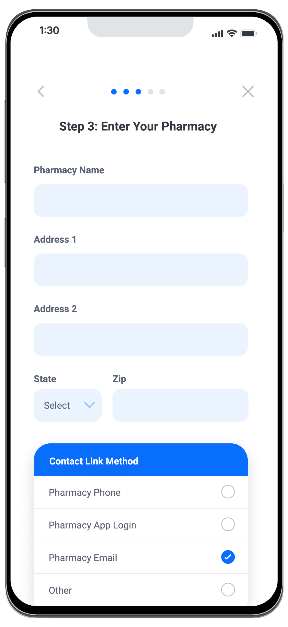
I began with a mobile-first approach and established some key themes, including simple iconography for navigation, implementing a blue color scheme to evoke trust and reliability in healthcare, and incorporating ample white space for a clean and minimalist design.
Sketch to Screen
Crafting Visual Styles
After crafting wireframes, it was crucial to develop a clean, bright, and modern UI design to evoke the trust and reliability intended to streamline our healthcare app.
To ensure consistency and reinforce our branding, I established some key standards:
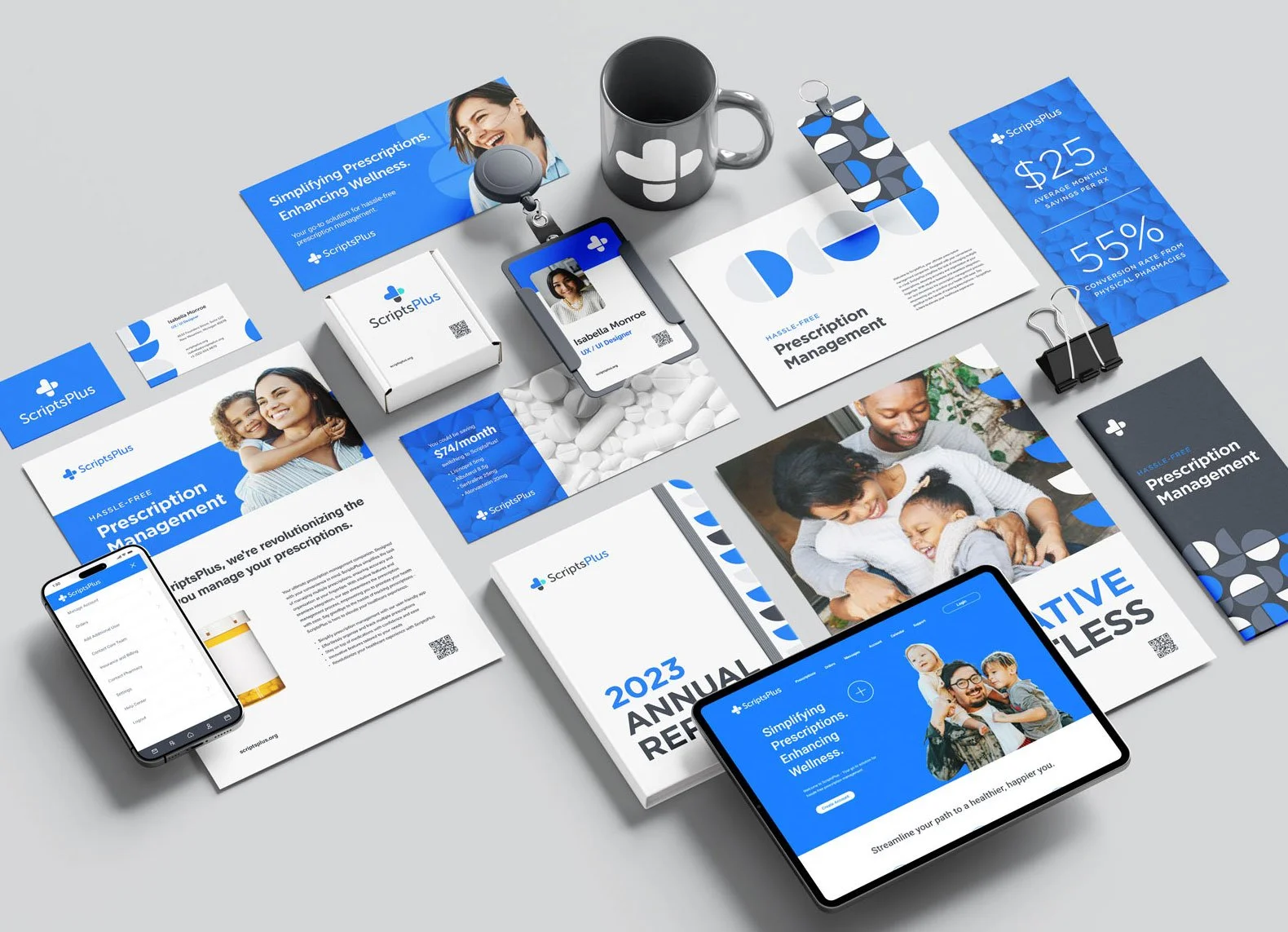
I utilized a blue color scheme to signify trust and reliability in healthcare, consistently applied across key functions within the app.
The blue color was thoughtfully integrated to denote actions or statuses, while keeping typography minimal to allow emphasis on buttons and icons.
I incorporated a simplistic circle pattern to mirror the pill shape in the logo and within the prescription industry.
Bright and fresh lifestyle photography was used to evoke a positive and easy experience for users.
Large typography was employed to highlight key elements for crucial understanding.
User Feedback and Usability Testing
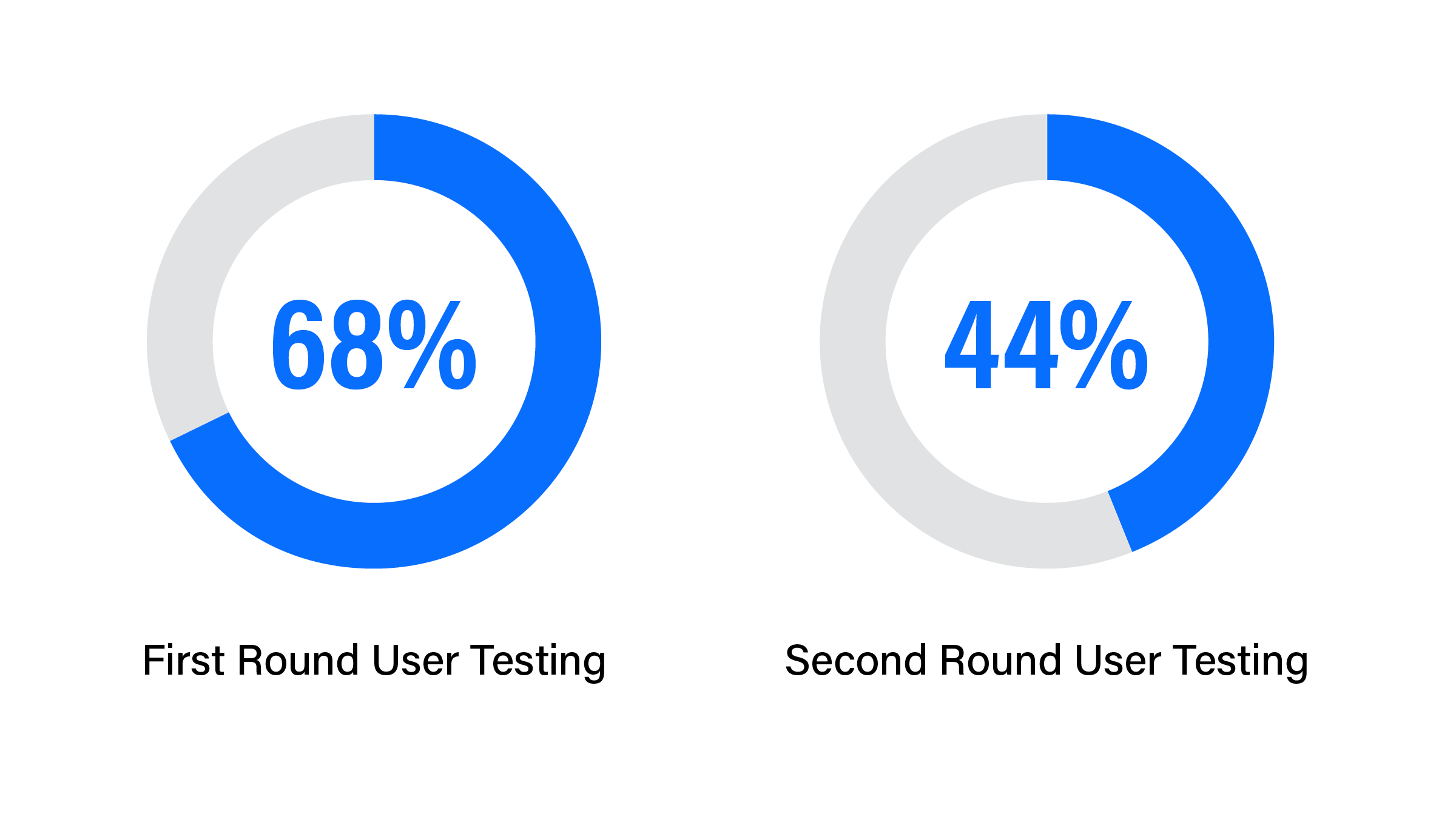
First Round Usability Testing Summary
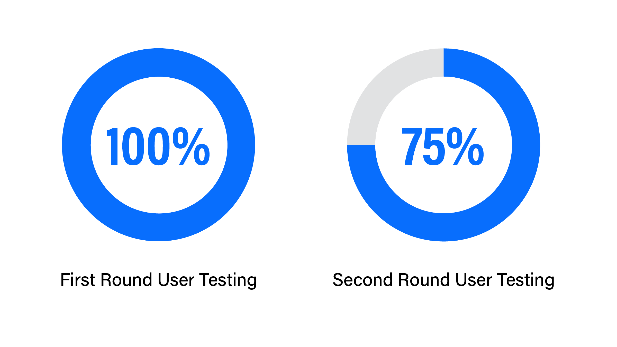
The first round of usability testing provided valuable insights from 5 participants, all of whom managed 3 or more prescriptions. Participants were carefully screened for their experience in managing multiple prescriptions. The majority managed their own prescriptions and those of another family member, offering valuable insights into the profile options within the app. Positive feedback highlighted features lacking in their current systems, such as auto-renewals, shipping, and communication between themselves, their pharmacy, and providers. As there currently isn't communication linking these parties, it proved to be a valuable asset in our app.
“I like how all of the selections, such as prescriptions and delivery, are in a different color, making them stand out and connect those things.”
– User Interview Participant
Second Round Usability Testing Summary
In the second round of usability testing with 5 additional participants, several key insights emerged. While the dashboard layout made sense to some, it proved confusing to others. Customizing the dashboard based on users' prescription needs, especially for those with fewer prescriptions, could improve clarity. Additionally, it became evident that the target market may primarily include individuals managing three or more prescriptions.
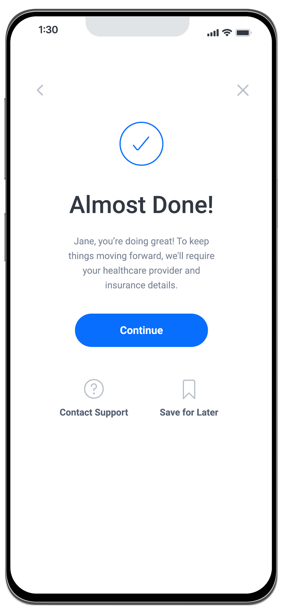
To enhance user guidance during account creation, revisions to the pop-up screen and "Sign up" header copy for clearer instructions are recommended. Providing concise next steps after account creation, such as completing profiles or adding prescriptions, would improve user onboarding. Clarity is also needed in the process of adding profile information, including indicating required fields and providing guidance on data entry.
Lastly, refining UI details, such as clarifying grayed-out options and the purpose of duplicate check-out buttons, is essential for smoother user interactions and overall usability.
Project Summary
Key takeaways from this project underscored the importance of starting with research to define goals before delving into solutions. Initially, I jumped ahead to solutions without focusing on user needs, drafting user stories with app functions but neglecting user needs and usage scenarios. In the future, I will clearly define a Minimum Viable Product (MVP) to ensure that the final prototype focuses on broader functions and usability rather than just microinteractions.
As a designer, I tend to prioritize visual elements like layout and color schemes, but UX emphasizes prioritizing user needs. While well-thought-out UI is crucial, gathering user goals and conducting targeted research before creating prototypes are essential for developing the best user experience. Close collaboration with team members throughout the process is also critical for identifying potential areas of enhancement before reaching the final high-fidelity prototype.
-
User Testing Satisfaction Levels
Overall user experience satisfaction levels
-
User Testing Success Rates
Success rates in completing a prescription refill order